Bear with me on this one. I promise you will see some of the chicest rooms if you hang in for the ride!
I am working on the Master Bedroom of clients in New York. I did the Foyer and Living Room of this Chelsea apartment years and years ago, around 2006, and was recently called back to do the Study and Bedroom. The clients wanted navy walls so I selected my favorite Benjamin Moore navy colors to be tested. For the record, those colors are "Newbury Port Blue", "Van Deusen Blue", and "Phillipsburg Blue". You can look those up later and put them in your file for the best navys. You're welcome.
The walls are painted and after rounds and rounds of fabric schemes, it seems we are in go mode with these selections:
CURTAINS:
A fabulous Sister Parish Design pattern called "Bolero" in Indigo.
BEDDING:
Trina Turk "Santorini" Duvet Cover and Shams in Turquoise with Jonathan Adler "Fish Scales" sheets in Navy and Turquoise:
And my 1st choice for a big rectangular pillow to go in front of the shams is this fabulous Martyn Lawrence Bullard for F. Schumacher fabric called "Adras Ikat Print" in color way (that's designer speak) Sky.
I received an email from the Mrs. of the house asking if I would speak to the Mr. to "explain to him how all the different blues will work".
I know how my end of the conversation would go: "It's fantastic. It's classic. IT JUST WORKS!"
Nothing else to be said.
The query got my mind rolling. I started thinking about the masters, the designers whose work I admire, and how they use blue and white. Anyone can take a bunch of blue and white fabrics and throw them all in a room and say they work because they are all blue and white. But can we say BOOOORING if the tones are all the same?? It's when another color is thrown into the mix that rooms come to life. The balance that is necessary happens with the mixing of tones. Period. It has to be done.
Take note of...
...the ever chic Carolyne Roehm, a Southern gal at the top of the New York social swirl, who has written an entire book on the subject. And note the color of the Ampersand sign. Aqua, Turquoise, whatever you want to call it. Try to see the cover of the book if the & was in the same blue as the words. It just wouldn't work. No pop. No focus.
In an article in Veranda in 2008 when the book came out, about the classic color combination, Roehm says:
"blue and white form nature's quintessential color combination. Blue and white are, she explains, the look of pristine snow against deep blue Aspen skies; spires of blue and white delphinium in a garden; Connecticut's spring mornings where the apple blossoms and nodding heads of white narcissus are in contrast to soft blue skies and vibrant green grass."
Hmmm....so it does take another color to make this really work? YES. The pop of the "vibrant green grass" is what makes the blue sky and narcissus so beautiful.
And in the NYC Master Bedroom, the turquoise and aqua in the Navy walled room with crisp white trim and ceilings work like the green grass with the apple blossoms and white narcissus and blue sky as described by Ms. Roehm.
But how do the masters of design create brilliance in the blue and white world? It only takes a look at rooms by BILLY BALDWIN, MARIO BUATTA, TODD ALEXANDER ROMANO, a Herrera (of the Carolina Herrera family), ASHLEY WHITTAKER, MEG BRAFF, and LINDSEY HARPER to see that it just works. Those names in all caps are some of the best of the best designers from the past to the present and here is what they have done...
...in Living Rooms:
BILLY BALDWIN:
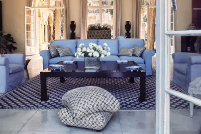
In what is quite possibly the chicest room of all time, the late great Billy Baldwin, showed why he is considered "the most influential American designer of this century", quote from House Beautiful, November 1999 issue, with what he created at Villa La Fiorentina, the residence of Mr. and Mrs. Harding Lawrence (he being the founder and CEO of Dallas-based Braniff Airlines), in Saint-Jean-Cap-Ferrat, France. FAB-U-LOUS! While all of the sofas and lounge chairs are upholstered in the same medium hued blue, the rug is navy and white and the ebony coffee table, basalt ware urns, and gilded ebony desk give visual weight and balance, the way the indigo background curtains will in NYC bedroom, to the otherwise all blue and white room. In the October 2012 issue of House Beautiful, Alexa Hampton said, "This could have been done last week." In other words, it's timeless and still oh so chic. And it was designed in the late 1960's!
MARIO BUATTA:
Oh, Mario. The "Prince of Chintz". The Prince of everything! In design school in the 90's, it wasn't possible to talk about good design without referencing this hysterically funny man who has been lauded over and over, and deservedly so, as creating some of America's best rooms. In a recent Architectural Digest, an article titled, "Master of Ceremonies", looked at the homes of Hilary Geary and Wilbur Ross, long-time clients of Mr. Buatta. This is the living room of the Ross's Southampton, NY, home which sings, sings, sings swathed in a liberal amount of Brunschwig & Fils' "Verrieres" fabric which has about every tone of blue there is. And small doses of pink and green cut the blue and provide visual breaks from the print flowing around the room.
A new, it is about dang time, book on Mario Buatta..and look at the color scheme of the cover! Blue, in multiple tones, cut with yellow. Perfect.
TODD ALEXANDER ROMANO:
Texas native Todd Romano has caught the design world's eye as of late with his most recent personal NYC living room design. This room has appeared on every bloggers screen since Architectural Digest published it last year. All blue except for small pops of color in the pillows and "a Ward Bennett wicker Sled chair and prints by Robert Goodnough and Josef Albers provide lively counterpoints." Look at the photo and then scroll back up to the images of the scheme for the NYC bedroom. Thanks, Todd, for the inspiration!
PATRICIA HERRERA LANSING:
When this project was published in Elle Decor a couple/few years ago, I thought it was so daggum good. The house is the Locust Valley (Long Island) weekend home of Patricia Herrera Lansing, fashion consultant and daughter of Carolina Herrera. Everything about this house works since it is, as the magazine titled the article, "All About Ease". In the library, various shades of blue and aqua are cut by the presence of a white sofa and solid neutral rug.
ASHLEY WHITTAKER:
Basically, Ashley Whittaker can do no wrong! Since starting her own firm in New York after training with Markham Roberts, this Florida native has done project after project after project and just gets better and better and better. Ashley is truly coming into her own now and the pages of all of the top magazines are coming to life with the design successes created by Whittaker.
One of the most recent hits of design ecstasy came while I was on a plane a couple of months ago catching up on all I had missed in the design world. When I came across this Greenwich, CT, dream house in House Beautiful Magazine, I couldn't get enough! From the living room......
 |
....to a bedroom.....
...it is just all fantastic! Brava, Ashley, for taking a classic color story and making it sing, sing, sing a 2013 tune!
Continuing with bedrooms, where this post began with the project at hand...
MEG BRAFF, Mississippi native New York based designer created "Classic Island Style" (Coastal Living Magazine) in an "open-air villa in Round Hill, Jamaica". The small doses of aqua in the bolster pillows and lamp shades make this room work.
another rising star and belle of the design ball is Georgia native LINDSEY CORAL HARPER whose New York office creates interiors all over the country including this Charlotte, NC, house that House Beautiful put on the cover in February 2012.
In two blue and white bedrooms, Lindsey chose a contrasting color to maximize the style and substance.
from the magazine,
"This large guest room needed graphic punch. She started with the Stark carpet, and ended with the Greek Key pendant light from C. Bell. Walls are painted Benjamin Moore's Van Deusen Blue. Vintage nightstands are from Liza Sherman. Julia B. bedding."
What did I say was one of my three favorite Benjamin Moore navy's? Yes, Van Deusen Blue.
And another bedroom is all blue and white and then intensified with green walls and pillows.
Back to BUATTA....and those same clients, the Geary-Ross's...this time, "thirty stories above Fifth Avenue, A World of Glamour and Romance". That's what Architectural Digest said when they published this apartment in 2005. Could it get any more blue and white?? Yes, it would have if Mario had not unexpectedly and expertly brought in lavender and yellow. Every shade of blue possible is in this room and...
IT JUST WORKS!
Back to nature and outside, where Carolyne Roehm said this color combo is formed, on three very chic porches, we have:
BUATTA again in the same Architectural Digest article, this time on the Ross's Southampton loggia where every shade of blue comes alive with the pops of aqua on the ceiling and in three pillows....
...and in Brazil where SIG BERGAMIN popped some aqua into the scheme by painting a classic wicker table a great tone. How boring would it have been if the table where white? I went mad over this project when Elle Decor published it.
and back to Jamaica, where MEG BRAFF continued the color scheme of the before shown project's interior out to the open-air living room where Meg was clearly inspired by BALDWIN to upholster all furniture in the same fabric but add the great Quadrille print as pillows which has a couple shades of blue in the print as well as aqua/turquoise.
And what are the poppy colors in this project? Braff took her cues from nature...The vibrant greens of the trees, the turquoise water of the ocean, and pink. PINK? Yes, pink, and it is fabulous in the umbrella and the flowers and the bikini-ed and saronged Lauren Phillips Blair, project manager of this large scale project and model for the day! She is beautiful and it, the design, is all beautiful....
....and IT JUST WORKS!!


No comments:
Post a Comment