Saturday, June 30, 2012

New York, New York meets Hydrangea blue heaven

Atlanta is in the middle of a major heat wave. It hit 104 yesterday, same today (it's 102 as I write this), and tomorrow will be a repeat performance. With no Cape Cod weather and water in sight (for today at least) and nowhere to escape but interior rooms, I am "cooled" by a pale green study, pale blue bedroom, and a view from both rooms of robust hydrangeas in both the limelight and classic blue varieties which got me thinking about the beauty of hydrangeas in New York last week.

Abingdon Square is our little "pocket park" (that's what Tim calls small, neighborhood parks) around the corner from our apartment in the West Village. This gem of a park underwent a major redesign and restoration a few years ago and has never looked better. When you live in only a few hundred square feet it is imperative to have a nearby park for escape so as to not go crazy with four walls closing in on you. When we are in New York, morning coffee (iced, of course) is picked up at the hip, yet charming, Chocolate Bar (www.chocolatebarnyc.com) on our one block stroll from the apartment on Jane Street to Abingdon Square where we enjoy a peaceful and beautiful start to the day.

When we were in New York last week, Hydrangeas were really putting on a show. Here is the view of classic blue and Oakleaf hydrangea that I saw every morning in Abingdon Square Park:


With the oppressive heat forcing me to remain indoors for a few days, I started thinking about some of my favorite flower print fabrics and how they have been used in calming, cooling, relaxing environments by top designers. And how grateful I am to have a bedroom swathed in blue and white (with touches of gray and soft greens) with a sitting area with views of the hydrangea in our backyard. It is about the only thing keeping me sane right now!! I am sure I will get cabin fever at some point, but for now I am content. One thing I know for sure: I will always have a blue and white bedroom.

My vast clip file of my favorite rooms and houses and my fabric library took me on a little excursion down memory lane as I flipped through page after page and fabric after fabric to find some of my favorite designs.I hope that these rooms bring some relaxing cool your way as you head into the Holiday week...stay cool and enjoy!


The worn out page of Elle Decor featuring this room by Jeffrey Bilhuber has been in my clip file for at least four years. I could sleep very well in this room and wake up in a good mood!


"Designer Jeffrey Bilhuber chose an iconic cotton print by Dek Tillett for the canopy and bed curtains in the otherwise spare master bedroom of a Regency Revival townhouse in London"-Elle Decor
photography by Simon Upton

This bedroom in a Sea Island House by Atlanta designer Suzanne Kasler has been in my clip file for years. It is one of the first projects by Kasler that I fell in love with. The architectural details (the x-design on built-ins) in crisp white with the neutral  carpet and soft blues, creams, neutrals just says RELAX. I love it!


"In the master suite, x-patterned closet doors designed by Kasler extend from floor to ceiling. Chair and ottoman, also Kasler designs, are upholstered in Nobilis Tangara. The curtains are Duchess Taffeta in blue from the Silk Trading Co. Carpet is Linen Rib Pistache from New Franco Beige. Floor Lamp is from Baker, Knapp & Tubbs. At the Gustavian marble-top desk, an antique French side chair from Ainsworth-Noah." House Beautiful, March 2007. photos by Tria Giovan.

Sometimes pretty is exactly what is needed. In this Florida bedroom by Todd Alexander Romano (the same designer mentioned earlier as the resource for Dek Tillett fabrics), a very soothing (and pretty) bedroom is just perfection. There is so little going on here (as opposed to many bedrooms with simply too much stuff everywhere) and that is what  makes it so wonderful. Using one fabric, a custom colored print by Travers & Company, T.A.R. achieved a lovely space in blue and white. In this article, Todd Romano is quoted as saying, "I like to nod to the best of the past, but make it fresher, lighter, and more modern." Well said and well done.

"To prevent sun damage to the custom-colored Travers & Co. linen fabric, the master bedroom curtains are four layers thick. The walls are stenciled in a white palm-frond stripe." Coastal Living magazinephoto by William Waldron.
Brightening things up jus a bit but remaining in the blue and white world, this bedroom by my friends (and Southerners) Meg Braff and Lauren Phillips Blair for Meg Braff Interiors really makes me happy. It has since the day I saw it in Coastal Living Magazine a couple of years ago and every time I come across it in my clip file, I just want to be there which happens to be Round Hill, Jamaica, so who wouldn't want to be there??

The blue/white print fabric is "Kashmir-Delft" by Raoul Textiles, the Chocolate Brown Cane and Rattan headboards are from Red Egg and Meg Braff selected them "to add a graphic, tropical touch to the feminine space."
Coastal Living magazine. photo by J. Savage Gibson.


Wednesday, June 27, 2012

New York, New York part 3: Specialty Shops in the West Village

I love a great specialty shop. It is on record that I loathe department stores. My ADD simply cannot handle overload when I am on the search for the perfect item, particularly when I am shopping for myself (which is rare, by the way). If I need an item, I want to go to a shop that specializes in that item, or at least specializes in a few items, not a store that has a zillion options and a million other things mixed in. As an editor and curator for clients, I appreciate an edited selection from which to choose in a small and charming environment.

I was thrilled to find several excellent specialty shops when shopping last week in New York's West Village. As Ralph Lauren, Tommy Hilfiger, Marc Jacobs, and the like, have moved in and taken multiple spaces and therefore caused rents to skyrocket, shops like the ones I feature here are becoming less and less the norm on Bleeker Street, Hudson Street, Greenwich Avenue, and Christopher Street, the main byways of the village.

The next time you are in New York, definitely put these three unique shops on your to-do list. If nothing else, it will get you to a wonderful part of town (our neighborhood) and take you on a little adventure in the city! But, more than likely, you will find some things you can't resist!

OVERBEY & DUNN
19 Christopher Street (between Greenwich Avenue & Waverly Place)

I discovered Overbey & Dunn on my last trip to New York in October. At the time, the shop was done up as a gentleman's apartment and was fantastic. Learning on that visit that "Overbey and Dunn is an evolving interior installation space of repurposed and antique furniture and home accents. Every few months Overbey and Dunn's environment will be curated with a specific theme in order to expose our prospective buyer to our unique vision of interior home design. Our inventory is a collection of unique, quirky, elegant, curious and always gorgeous furniture and objects. Whether it's a lamp, a vase, a birdcage or a loveseat we have elected a highly edited and concise collection of goods that not only are stellar stand alone pieces but when merchandised well, these pieces create sharp, fastidious and thought provoking vignettes within our space", I knew I had to go this trip to see what the newest installment was. I am thrilled I did. Claiborne Swanson Frank, whose apartment I LOVED when it was in Elle Decor earlier this year, has transformed Overbey & Dunn into "American Beauty: a pied-a-terre". Tres chic, my friends, tres chic.

here is an image from Elle Decor showing Swanson Frank's living room. You can see her photography work on the back wall and see how her style seen here.....

...has been transferred to Overybey & Dunn, both in the current window display.....


...and from the initial installation (pre mad shoppers buying it all up!) as shown on Overbey & Dunn's website....


American Beauty is the title of Frank's new photography book which is available for sale in the shop:

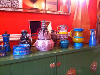
and here are some of the items that I particularly liked when I was there last week...


..from the above ceramics I really love these three pieces and am proposing the blue and multi-colored vase for a client's foyer..


...and this double candlestick is perfect for the cocktail table in the living room:


I really dig needlepoint pillows done in a funky color scheme or pattern. This round (slightly oval) "Love Birds" pattern in purples, pinks, golds, and black is perfect for the sofa in the family room of a Chicago client. I love it!


"Love Birds" Embroidered Pillow-app. 15" round


On the way out of the shop I snapped a photo of this well-done vignette featuring a Claiborne Swanson Frank photograph, a fabulous pair of lamps, gilded cocktail table, and a GREAT multi-colored glass vase. OH, the candle that is burning is fantastic. I was aware when that the shop had a lovely scent smelled but didn't realize that it was a candle burning until I was leaving. I learned from Molly Kavanagh, the charming co-owner of the shop, that the scent is "Grand Manchou" by Panpuri. I had to have it and so, as I write this, my office is enveloped in the fabulous scent that I found at Overbey & Dunn. It seems that only Barney's (I'm assuming throughout the country) and Overbey & Dunn sell the candle. If any of you find the candle somewhere in the South, definitely let me know!


THE BATHROOM
94 Charles Street (between Bleeker and West 4th)
www.inthebathroom.com


Two of my favorite things--a striped awning and bath products--can be found here!


the bathroom. (I love how it is lowercased and with a period making it so definitive) is a big guilty pleasure of mine! I've frequented this shop for a few years now and upon discovery of my absolute favorite shower gel about two years ago, always have to stop in to replenish the stock when I am in New York.


This place is chic and very well edited...
the bathroom.
photo from New York Magazine
"If it's beauty you're after, you really have to go to The Bathroom. This airy, artfully shabby-chic nook carries high-end bath and body products--more than 3,000 of them, in fact, on its antiqued shelves."--New York Magazine


In addition to my beloved shower gel which is Spuma di Sciampagna Silk Shower Gel....


...the bathroom. carries two of my favorite candles:


French Tulip by Seda


Rigaud candles--any scent

as well as my favorite liquid hand soap which is Verveine by Savon de Marseille
I'm telling you..if you want to pamper yourself on your next visit to New York, go to the bathroom. on Charles Street! Buy my product recommendations and send me a thank you note once you've tried them and can't resist buying more!

OH, if any of you find my shower gel anywhere in the South, please let me know!

THE MEADOW
523 Hudson Street (between Charles and West 10th)
www.atthemeadow.com

Our all-knowing friends Irene and David took us to The Meadow. A shop specializing in salt and chocolate is definitely not anything I would have thought I would love. I could care less what salt I have and I don't love chocolate. So I wasn't so excited to go to this shop. 

I walked in and these INCREDIBLE roses greeted me. Along side other beautiful flowers filling an entire farm table. I was intrigued. Salt, chocolate, flowers?? I learned that The Meadow is a Portland, OR, based shop with only the Portland and New York locations, and flowers are, in fact, a specialty. So think of this as your neighborhood flower market and pick up a chocolate or a caramel (they are yummy but not quite as good as the ones from Cacao in Atlanta) while there.


and then I saw the wonderful figurative paintings by artist Roger Hallin. I was gone.. far, far away from my friends who were gabbing about salt and chocolate. These fantastic mixed media on paper pieces by the Portland artist are just beautiful. I'm very into figurative work right now (more on that in a future blog post) so these made my day.


for more on Roger Hallin's work, visit www.atthemeadow.com

OK, back to the salt....
I recently completed a very wonderful and very modern kitchen for a client. All white and stainless and fantastic, I hadn't even pondered what sort of items would be out on the pure white quartz counter tops until my client emailed me an image of a possible cooking utensil storage vessel. When I saw the sort of French Country-esque ceramic piece (very attractive and perfect for an old beach house kitchen but just not right for this kitchen), I realized I needed to specify clean, modern, nearly disappearing functional items to keep the look as it should be.

VOILA! Who knew that Peugeot (yes, the European auto maker) makes fantastic salt and pepper mills?? And the mills pre-date the cars. Well I now know and these are most definitely the ones I will have in our own house and will recommend to all clients from here on out.

"Nancy" Salt and Pepper Mill Set
4.75" high, $ 47.95 from The Meadow


and these are the larger sizes of the "Nancy" model..$ 37.95 for the Salt Mill and $ 37.95 for the Pepper Mill

SO, clients (all of you, but particularly the one with the new kitchen!), get online now at http://www.atthemeadow.com and order your salt and pepper mill!


I hope you are all having a great Summer with lots of travel plans! If your travel plans include New York, definitely visit these shops when there. 


Enjoy!


Jeffery

Tuesday, June 26, 2012

New York, New York part 2-D & D Shopping

A big part of each trip to New York is a day spent at the D & D Building shopping for fabrics, trimmings, and wallcoverings for client projects. Although I now live primarily in Atlanta where there is a to the trade design center (ADAC), with the exception of Travis & Company at ADAC, I still prefer to shop at the D & D since I know the building like the back of my hand. I worked in the building for several years and know all of the showrooms and the staff in the showrooms. I shop the building for a day and get all of the samples shipped to me.

Waiting on them to arrive is like waiting on Christmas to get here! And yesterday saw the arrival of a few of many u.p.s. packages that will appear on my doorstep over the next week. Here are some of my favorite collections I discovered on this trip to NYC:

F. Schumacher never disappoints with the collaborations they do with leading designers. I found to die for fabrics by Lulu DK, Trina Turk, Martyn Lawrence Bullard, Celerie Kemble, and Matthew Patrick Smyth including these:


Lulu DK (Lulu de Kwiatkowski) is an artist first and foremost so her fabric collections always have a painterly quality. Although this collection is billed as "Lulu DK Child", many of the fabrics are so perfect for non-childlike room. The fabric shown above in 2 color ways is called "Cha Cha". You can see that it is essentially a painters brush strokes design. I would love to do curtains in this fabric in a beach house bedroom or den. The white fabric with two shades of blue dots is basically an updated version of the Hinson & Company classic "Spatter-Blue/White". Lulu reinvented it in blue and navy embroidered dots on white cotton/viscose ground. It is called "Skittles-Blueberry and Sky". And the FAB tape trim/curtain border is called "Twixt". I have proposed the middle color way as the border on white curtain panels for a bedroom in a Michigan lake house project I am working on.


California fashion designer Trina Turk designs my favorite outdoor fabrics. Always chic and graphic and with a modern twist, the collection at F. Schumacher is fantastic. The above trio is being presented to New Orleans clients for their new screened porch and patio furniture. Shown above left to right are "Trellis Print" in dune, "Zebra Print" in dune, and "Arches Print" in orange.


One of my favorite patterns to come out in the last year is Martyn Lawrence-Bullard's "Adras Ikat" in color way Caravan. I think it is one of the chicest patterns to appear on the fabric scene in a long time. I have proposed it for curtains in the den and kitchen of a Lafayette project. I hope she goes for it! If nothing else, maybe we will do pillows like this one available on Etsy for $ 95 for 20 x 20 pillow


here is the link to purchase the pillow:

http://www.etsy.com/listing/99741822/20sq-schumacher-adras-ikat-pillow-cover?ref=sr_gallery_5&ga_includes%5B0%5D=tags&ga_search_query=ikat+pillow&ga_page=1&ga_search_type=all&ga_view_type=gallery

I am always on the hunt for great geometrics for pillows and seat cushions. Designs by Celerie Kemble and Matthew Patrick Smyth, both New York City interior designers,  fit that bill perfectly.

Here is Celerie Kemble's "Betwixt" in six color ways:


and Matthew Patrick Smyth's design "Durance Embroidery" in Limestone, Mineral, and Greige samples are on their way to me:


oh, ROMO, how I love thee!

Although I have done many interiors with a primarily neutral canvas, color is what I love. I can't stand an all neutral room so even if a client prefers mainly neutral, I always sneak pops of color. The design team at the UK based brand are brilliant colorists. Here are a few of my favorite designs that I scouted for client projects at the D & D Romo Showroom:


I am in love with this design called "Picus". From top to bottom, colorways Zinnia, Nougat, and Rocoto would add great pop of color in a room. Pillows and/or curtains in this fabric would be tres chic!


I need a traditional print for a pair of chairs and dressing table chair in the master bedroom of a project in Michigan. For me the design needs to be traditional but with an updated color palate, not Grandma's chintz. I am presenting the above four fabrics to select from. Clockwise from top left corner: "Floriane-Cerise", "Marguerite-Cinder", "Mikado-Porcelain", and "Mirabel-Cerise". I personally hope they go for the "Mirabel-Cerise"! I really like the chartreuse birds on natural linen grounds with the pop of Cerise color.


For a New Jersey client's living room, I only need one more fabric to make pillows for a pair of chairs. I am presenting these three fabrics by Romo as options for client to decide. The Chinoiserie print is called "Samsara Vintage" and the FAB geometric is called "Haring". If you know art, then you will know that the design is based on Keith Haring's paintings.

To say that I was thrilled with the Spring Collections I saw in New York last week is an understatement. I saw so much happy color. Enough of all neutral and black and white!

For more information on any of the above items, contact me.
FYI, in the South you can find F. Schumacher and Romo fabrics at to-the-trade design centers in Atlanta, Houston, and Dallas or through a design professional.

Sunday, June 24, 2012

New York, New York-Part 1

Tim and I just returned from a quick trip to New York. As a designer and art consultant, it is absolutely necessary for me to visit the city at least a couple of times a year. The inspiration that I get from being there is just incredible! I leave exhausted yet invigorated, a weird combination that is akin to the love/hate relationship that many that live (or like us, lived-past tense) in the city feel constantly.

I spent lots of time shopping, both for specific projects and just because I needed to be in shops to keep my finger on the design world pulse.

Shopping trips to New York are hard to navigate since the list of great shops is endless. I primarily shop the West Village (the neighborhood where our apartment is) and the Upper East side. I always find really great pieces for clients (and for us, of course!). Here are three of my favorite resources that are within minutes from our apartment in the West Village.

LA MAISON SUPREME
614 Hudson Street between Jane and West 12th
www.lamaisonsupreme.com

LA MAISON SUPREME
617 Hudson Street between Jane and West 12th
www.lamaisonsupreme.com


Elle Decor magazine said, "Worthy gifts, linens, and new and antique Haviland china are the focus at La Maison Supreme."and HOW! The shop is choc-a-bloc with so many wonderful pieces--china, glassware, chandeliers, dinner napkins, bedding, vases, candles, soaps, etc, etc.

Here are a few favorite items that I spotted:

LOVE these orange and white dinner napkins and four are now in our house in Atlanta:


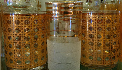
and I think the gold caning design tumblers are TRES chic. I am definitely presenting these to a client...


..to be paired with these water glasses in her dining room in Lafayette. I love the traditional gold bands with the more modern geometric design for a great juxtaposition of styles.


a set of circa 1940 Candle Light Limoges China caught my eye. La Maison Supreme has many pieces in this pattern.


La Maison Supreme has tons of ready made pillows-all of beautiful fabrics and trimmings. This one is now purchased and on its way to a Chicago client of mine.


ABINGDON 12
613 Hudson Street between Jane and West 12th

"Eclectic", "unexpected", "one of a kind", these are some of the terms visitors use to describe this West Village treasure tucked into a pre-Civil War townhouse on Hudson Street just off Abingdon Square. 

above are words from Abingdon 12's website. I've visited this jewel of a shop for years now and am so glad to see that Alabama native Paul Caddell's curatorial brilliance is getting noticed. You never know what you might find when you pop in. Whatever it is will be interesting and very good, I assure you.

Lonny Magazine recently featured Abingdon 12 in a great article. Here is the opening page:


and one rainy day last week I found these items that I can't stop thinking about..

Swedish metal candle holders-$ 50/pair


This 1950's double lamp with embossed rattan design shades would be great used so many places but particularly good for a bedside table between twin beds or on a console table in an entry or den. $ 150.


I really "have a thing"right now for pieces with a combo of lucite and silver. I think these salad servers are fantastic! $ 85.


and this salad bowl is funky and fun. $ 60.


TEICH
22 Eight Avenue between Jane and West 12th
www.teichdesign.com

There once was a shop called Auto in the West Village that sold interesting items designed by and/or made by local artisans. Every December 20th or 21st, I would run into Auto and knock off my Christmas shopping list in about an hour flat. I was devastated when Auto closed three or four years ago. I no longer have to be devastated since the opening of TEICH right around the corner from our apartment! Representing local artisans of good design, Teich has items for men, women, kids, and home.

I am in a fun sock phase right now and this wall display of hook+Albert socks (www.hookandalbert.com) thrilled me...


....and these patterns came home with me. I see major design project inspiration in the striped patterns!


FYI, Nordstrom and Barney's Co-op both carry the hook+ALBERT line so those of you not going to New York can buy these great socks at Nordstrom and Barney's locations throughout the country.

The other big discovery at Teich is the line of bags by Ernest Alexander (www.ernestalexander.com).


Because I am always carrying around something related to projects, I need a bag at all times. Sometimes a big shopper, sometimes a messenger, and sometimes just something small to house my phone, pens, a note book, and a sample or two. The "Banker's Zip Folio" seems to be the perfect design to meet the latter requirements. Available in six colors (4 in a waxed canvas finish and 2 in leather), I am leaning towards the orange or brown waxed canvas:


For a true shopping bag, these Ernest Alexander designs are at the top of the list...


In addition to Teich in New York, the Ernest Alexander line is carried by Club Monaco throughout the country.


Also at Teich, I discovered the art of Kazuya Morimoto who does wonderful sketches (above and below) of the city.
From his website, I learned that Kazuya Morimoto is:

New York City based artist Kazuya Morimoto was born and raised in Japan and studied at the Art Factory with Makoto Arimichi. Shortly after graduation, Kazuya moved to New York City to study painting at the Art Students League. Since 2000, he has focused extensively on abstract painting. He was awarded several grants and scholarships and has had exhibitions and public art displayed in New York and Washington DC.
He traveled to Europe in 2006 and goes back every summer for independent study. Since then he has started to sketch and paint street scenes. He also created a printmaking series of imaginary city scapes based on his travels. Now, he can be seen all over Manhattan sketching and enjoying meeting people, drinking good coffee and thinking about his next trip or food.


Check out http://kazuya.carbonmade.com/ to see more Kazuya Morimoto pieces.

That's all for today! I'll be back in a couple of days with more exciting finds from the New York trip.
For more info on any of above items, feel free to contact me or the shops. 

Best,

JM